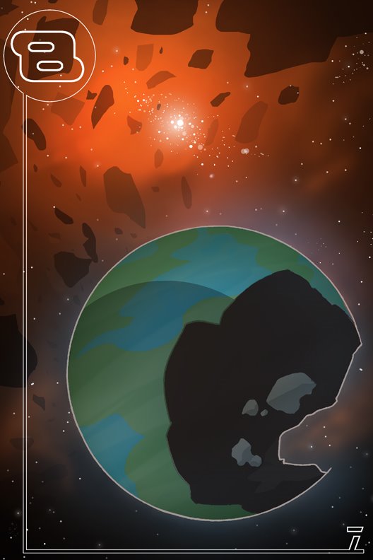
Man, thank you all so much for steppin up to the plate when I needed it. After taking in all your suggestions and etc, this is what came of it. Whatcha think?
I like it. It's an awesome peice. I thikn your color choice rawks...
And no offense is intended and feel free to ignore me, I am jacked up on Starbucks' Pomegrante frappucino Juice Blend but I would reccomend That you tone down the space background use a more muted color, and adding more more star clusters with a decreased halo glow and make the planet pop by increasing the hue of the planet. Maybe adding a warmer color to the pallet
I am assuming that you want planet to be the focal point, yes. Right my eye is drawn to the cluster, above the planet.
Just my 2 cents. and like I said feel free to ignore, most of that was just me thinking out loud.
6 comments:
excelent! your blog it cool! i like bastion´s 7.
please visit my blog http://benjamintrobat.blogspot.com
I like it. It's an awesome peice. I thikn your color choice rawks...
And no offense is intended and feel free to ignore me, I am jacked up on Starbucks' Pomegrante frappucino Juice Blend but I would reccomend That you tone down the space background use a more muted color, and adding more more star clusters with a decreased halo glow and make the planet pop by increasing the hue of the planet. Maybe adding a warmer color to the pallet
I am assuming that you want planet to be the focal point, yes. Right my eye is drawn to the cluster, above the planet.
Just my 2 cents. and like I said feel free to ignore, most of that was just me thinking out loud.
peace
thanx, activar!
good point, b.fishmaniac. i'll tone the cluster down.
DAMN! I can't wait for this book.
I'm mean, fuck!
Post a Comment